Enhanced corporate design of PCI catches the eye
Focus on the essentials
17.09.2021

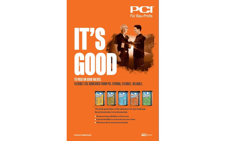
PCI Augsburg GmbH has enhanced its corporate design and is focusing on the PCI brand color Orange for an eye-catching effect. Together with short and concise headings and new fonts, the new design stands out more clearly than before.
In recent months, PCI has scrutinized the appearance of its brand and raised it to a new level. The further development is clearly aligned with the PCI brand positioning and brand values and is also oriented towards the design language of the future.
Text and visual language are focused on the essentials in all visual implementations. Expressive, striking and concise headlines catch the reader's attention and get straight to the point.
At the center of the new design is the corporate color Orange which visually conveys the PCI identity like no other element. Applied over the entire surface, it catches the eye and creates attention-grabbing messages, but also creates a differentiation on the market. Exciting motif layouts and new, modern fonts are the core elements of the new design.
The new corporate design appeared at the PCI-Alpencup 2021 in full-page advertisements and in online advertising for the first time. PCI is now continuing on this path and is making the design change visible step by step on all channels and in all communication media.
Downloads
-
Enhanced corporate design of PCI catches the eye
